• All FMI products
• Power grid main page • Information • References • Acknowledgements • Archive
Modelled GIC in the Finnish and Norwegian power grids.
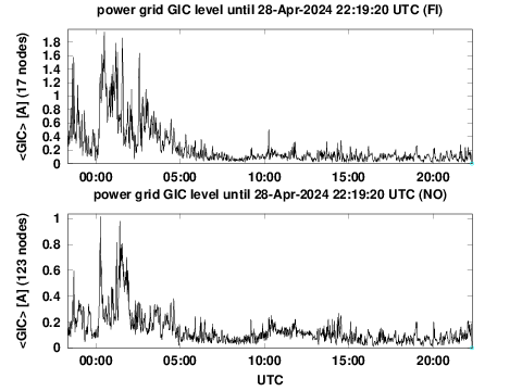
Red colour appears when the sum of GIC divided by the number of nodes belongs to the top 0.1% of all values based on long-term statistics. Cyan dots on the time axis refer to time steps at which data from less than half of magnetometer stations are available.
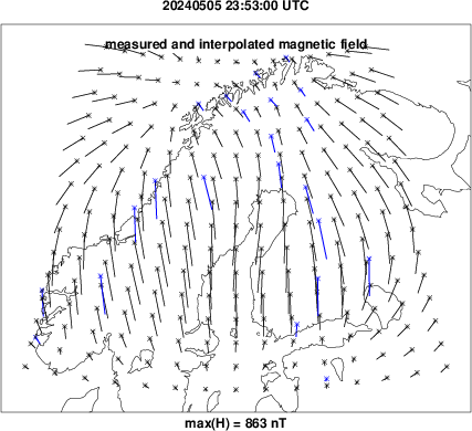
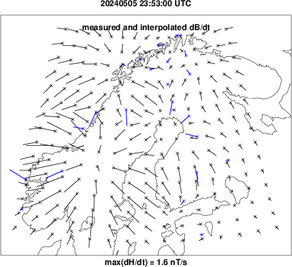
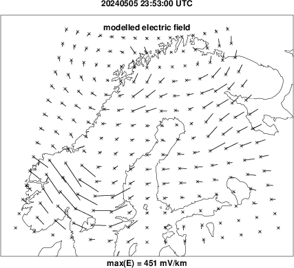
Following plots correspond to the time of the largest GIC sum in the power grids during the latest 24 hours.
  |
 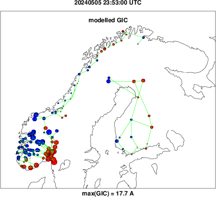 |
For the magnetic field and its time derivative, blue arrows are measured values and black arrows are modelled values. For GIC, red dots denote current from the grid into the ground and blue dots denote current from the ground into the grid.
Interactive maps to display the latest hour, and text files of the latest 24 hours:
• -
• -
•
-
•
-
This page is automatically created. There is only a simple automatic quality check of magnetometer data, and we cannot guarantee an error-free service.